*This Tip is from a post I did on the Noel Mignon Blog on July 4, 2009
Ok so taking pictures of your layout is never easy -- I know I put it off until the last possible minute. But here is a couple tips I have for you. First, take your picture in indirect sunlight --- I use the kitchen, and sometimes even take it outside on my patio table. Some other ways I have taken photos are: *scanning it (although I had a 12x18 scanner so I don't know how to "stitch" the layout together) *I also used to place it right on the ground on top of a white towel and shoot directly above it. I did this outside in the evening. *If I am running real late on a deadline I will use my external flash inside and that usually gets a decent picture. I want to show you where I start with all my layouts. I upload into Picasa and usually crop it (for me it is easier there than in PSE. This one is not cropped but it shows you what my photo looks like straight out of camera. Not too hot - look at all that background noise --and just fyi - I have a cookie jar propping my layout up. Sometimes I will use a little display easel but that means everything has to be nice and neat and lately that ain't happening! LOL!  Ok so this is what it looks like with the background noise cropped out. Note: This is in Picasa
Ok, now I need to brighten this layout so it looks true to life.
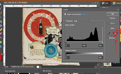
In photoshop elements (and this works in PS too), I go to.. ENHANCE>ADJUST LIGHTING>LEVELS
 Now you should see this on your screen. When you do click on the WHITE eye dropper.

ok with that white eye dropper you will take it to your layout and click on anything that is white. When you click it you will see your layout "pop". I would suggest not settleing on the first pop -- some white parts are lighter than others and you have to find the right click to make it look true to life.
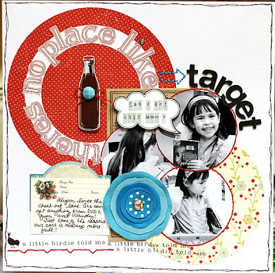
This is what my final take looked like

Big difference from the first one huh?
I believe I got this frame from a former student one year. It is so pretty but I never put it to use. So I decided to do just that and create the little framed tree.
I cut a piece of felt to fit the size of the cardboard that was in the frame. I adhered it with hot glue.
I then traced a triangle onto the fabric. I made sure it would fit in the open window of the frame. (You wont need the glass).
I then stitched it onto the felt with my sewing machine.


